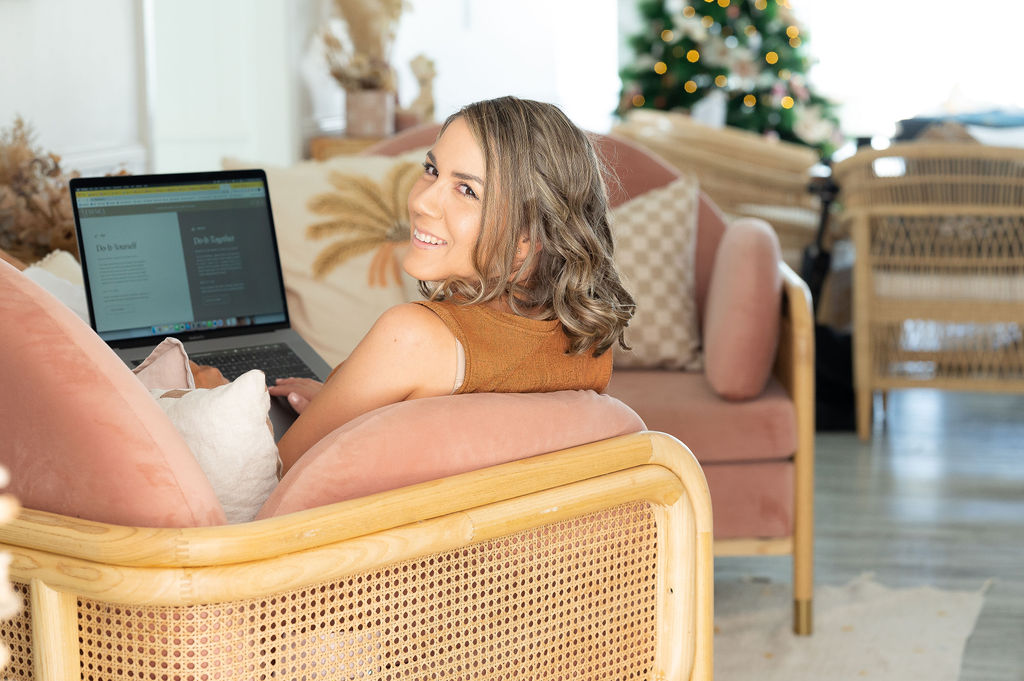
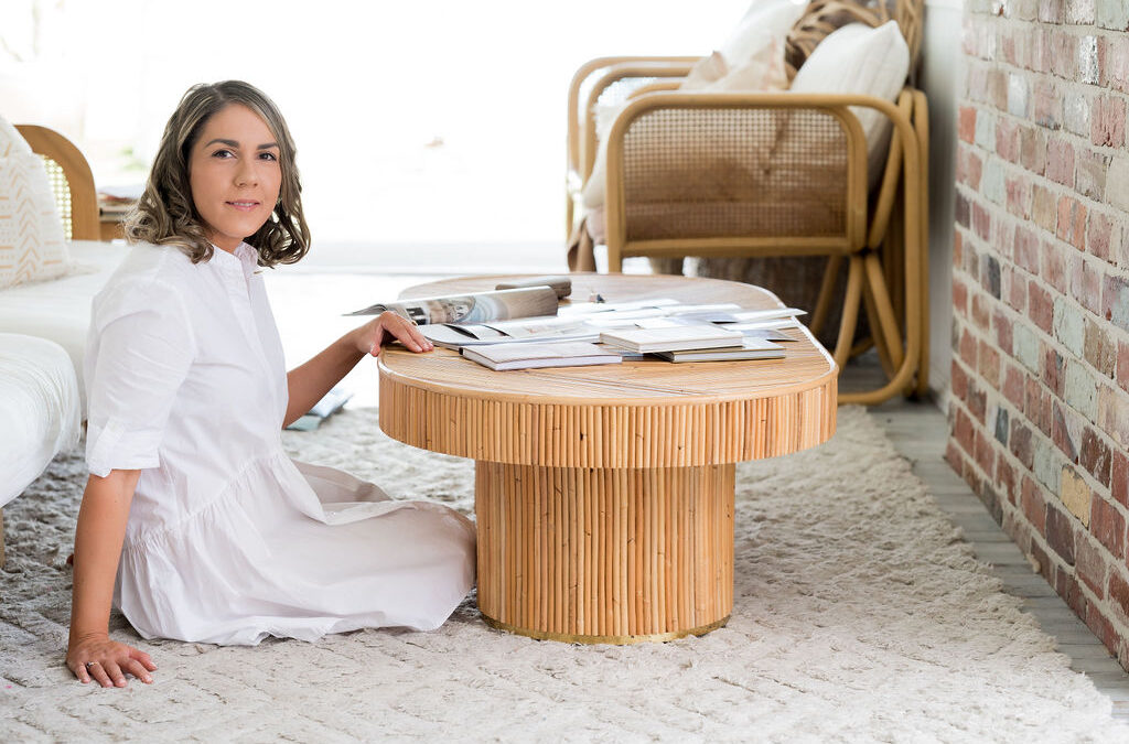
Carly is the powerhouse behind St. Comunica, a brand and web design studio dedicated to crafting beautiful, high-end, and more accessible designs.
Whether you’re a solopreneur starting from scratch or need a website refresh, Carly specialises in guiding online service providers, coaches, and consultants to bring their dream brand and website to life so they can stand out, attract their ideal clients, and effortlessly sell their offers.
The algorithm led me to Carly in 2023 before I discovered we were in the same coaching program. We have stayed connected since. I interviewed Carly recently to talk about everything related to her design process, client communication, trends and tools, and, of course, one of my favourite rant topics: bots.
Walk us through your ideal design process. What are some of the decision points or milestones that define a project’s direction?
For branding and web design, my process is all about getting to the heart of the client’s brand so we can connect with their audience on a deeper level. I typically approach it in four phases. The first is discovery, where I aim to gain a deep understanding of the brand, audience, and competitors. I then review existing materials to understand the brand positioning, messaging, and visual identity.
Then, we move on to brand strategy. Once I’ve got a handle on the brand, I craft its plan, which involves defining its mission, creating audience personas, developing its differentiating factor, brand personality, and overall visual direction. That’s one of the critical decision points.
We get into the fun part once they agree on the visual direction. I bring the brand to life and craft visual concepts that capture its personality. That includes logos to colour palettes, font pairings, and any other brand elements or patterns they may use. I usually present two concepts and collaborate with them to refine and finalise the design.
The last step is implementation. Once the brand identity is created, it’s time to roll it out across all the touchpoints, things like business cards and social media graphics. Then, I’ll move on to website design.
Do you use AI design tools? What impact do you see them having on your field’s future? How can designers leverage AI as a collaborator rather than a replacement?
I’ve dabbled a bit in AI, and incorporating it into the design process has some perks. It’s like having a brainstorming buddy so you can bounce ideas around and collaborate with them. It adds value to your service because you can use it to get insights.
One handy tool is Mid Journey, which allows you to create or generate images for website banners. Often, you have to keep feeding it prompts, tweaking the style or adding more keywords, specifying not only what you want but also what you don’t want. I’ve seen many designers edit it and create photo compositions using Photoshop to get something cool that differs from stock photography. It’s a great way to speed up the creative process and offer a fresh perspective.
What is the most underrated or overlooked aspect of successful branding and web design beyond the visual elements?
Brand strategy is the backbone of a brand’s success. Like a house needs a solid foundation, a brand needs clarity on its mission, audience, and unique value proposition to connect genuinely. I often see business owners diving straight into the fun, aesthetic stuff like mood, boards, colours, and fonts without stopping to ask the question or looking at the bigger picture:
💮Why does my brand exist?
💮Who are we talking to?
💮What sets us apart from the competition?
Getting crystal clear on these answers sets the stage for a killer brand and website that authentically connects with its audience. I use Disney as an example. They’re masters at weaving storytelling into everything. They don’t just sell products; they create a great story through a movie with a theme and characters to draw in our emotions. Then, they build a whole line of products around that story. That’s the power of having a solid brand strategy.
Brand strategy lays the groundwork for how you want your audience, customers, or clients to perceive your brand. It guides us in crafting a visual identity and website that strategically brings this vision to life.
What emerging trends or technologies excite you most? How do you see them affecting the future of web design?
AI, as we’ve touched on, but something else that’s intriguing is voice search. I’ve been looking at the possibilities of voice search with websites. Instead of typing in stuff or clicking it around, you can talk to your website. That will change the game and how we interact with websites in the future. We’re still several years away, but seeing how it plays out will be interesting.
Then, I think there’s a whole focus on making websites accessible to everyone. Designing things with screen readers and easy keyboard navigation will become more critical. That can also boost your site’s rankings on search engines. I think accessibility requirements are going to be key moving forward. Then there is AR and VR. It’s still in its infancy, but you could browse through a store or check out a product in full 3D right from your browser. We’re stepping into a whole new world of website experiences in the future.

What strategies do you use to make high-end design accessible to clients with varying budgets? How do you ensure the final product reflects that premium quality?
Most small to medium business owners don’t have, or want to spend, thousands of dollars to invest in branding and web design. To make these services more accessible, I’m developing a done-with-you program that gives online service-based businesses the tools to DIY their dream websites without spending 10k.
It’s like having a designer in their back pocket to guide them every step of the way. I show them how to craft their brand strategy, work with them to create a professional brand kit or brand identity, and then help them build their website and set up this sales funnel using my premium Showit website templates. It’s more than a course. It’s a community they get access to for a year with live coaching and feedback. It also gives them all the tools and templates they can easily plug and play without worrying about designing anything from scratch.
I specialise in Showit websites, which I love because it’s a user-friendly drag-and-drop platform like Canva. It’s an excellent choice for creating unique, visually appealing websites without knowing how to code, cutting down on many traditional development costs often associated with custom builds. I also offer a website-in-a-week service. I take my pre-designed Showit template or a template the client has purchased and customise it to suit their brand, making it more affordable to get a premium, custom website without the price tag.
Communication and navigating creative differences. What is your approach to encouraging that and building trust with your clients through the design process?
Throughout the process, I’m all about collaboration. I make sure that my clients’ voices are heard every step of the way. So when I onboard a client, I set them up with a dedicated client portal in Notion, a project management tool similar to Asana that encourages open communication and feedback.
At the beginning of every project, I host a strategy session. We discuss their branding and website goals in depth. Once we’ve completed the brand strategy, I create the visual direction. That helps to make the process a lot smoother because I do that before I start on their brand identity. This ensures that the client is on the same page before I begin designing, so it’s not a surprise and makes the whole process much smoother. I also use Loom to explain my design concepts and how I came to a specific decision.
I encourage my clients to be open and honest with their feedback so they can fill out a feedback form. I ask some very particular questions to probe deeper. If something doesn’t gel with them, we’ll jump on a call, unpack it, and address any concerns they have. I want to make sure they’re 100% happy and in love with their brand or website before we even launch because it’s important to me that they feel confident and passionate about their digital presence from the get-go rather than discovering later on that it didn’t resonate. That’s why involving them in that process is essential throughout. It’s not just that you’ve employed me; it’s an integral piece of branding and a consultative process.
Design trends are constantly changing. How do you create brand identities and websites that remain relevant and visually appealing even as they change over time?
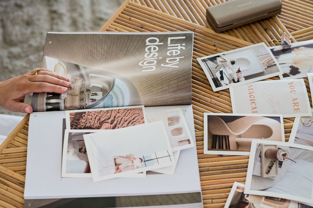
For me, it’s about finding your design magic. That’s key. I’m all about staying true to a brand’s essence rather than chasing fleeting trends. To do that, you need to source original inspiration. I learned that from my design mentor, Ariel Garcia. She instilled in me the importance of drawing inspiration from everywhere. It can be old magazines, architecture, photography, interiors, a stroll down the street in another country, or even a product’s packaging design.
Looking for examples of great design in the real world means taking photos and making notes of anything that catches your eye and sparks creativity. Layering different styles, textures, and patterns helps add depth and sophistication. Layering also ensures that your designs possess a timeless quality capable of enduring the ever-changing trends.
I’m also currently enrolled in Ariel’s program, which offers a unique perspective on cultivating a signature design aesthetic so that you can create standout work. I still need to nail it and figure out my signature design aesthetic. It’s about crafting designs that transcend times and ensuring they maintain relevance and capture audiences. In the future, a client may feel like they’re no longer resonating with their brand and think that they need to rebrand, which happens as they evolve and grow their business.
That’s where you can start with fresh eyes, hone in on your target audience, and develop a visual identity around that. Ideally, you don’t want clients to rebrand every year or two unless their business radically changes. You want to make sure that their brand has that strong recognition in the market so that as they start to promote their services, even if they’re not using their logo, it becomes recognisable and stands out. You might notice that when you scroll social media. You see someone’s post and their fonts, images and colours and recognise it immediately.
In the long term, your brand comes back to consistency and applying it over and over, and that’s how we maintain that top-of-mind awareness as well.
I look at other designers’ work passively, without realising you are absorbing it. I don’t want to copy other designers, but I want to keep up to date with what’s happening, particularly in AI. I may not be an early adopter or a big user of it. But how can we integrate these things? And how we can shift our process or make it better.


